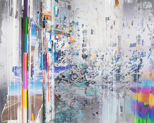
15/10/18 To begin the art project we looked at some contemporary artists in the 'Art' field. As the art project looks at 'chance' many of the pieces that the presentation featured had elements of chance in them.
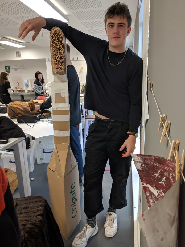
We were divided into groups and asked to pick an object at random. The assignment was to recreate the object larger than life. My group got a toothbrush.
|
|
|
|
|
PHOTOGRAPHING the model17/10/18 We had the word 'patterned' in mind (chosen by chance like the toothbrush was).
|
Experimentation
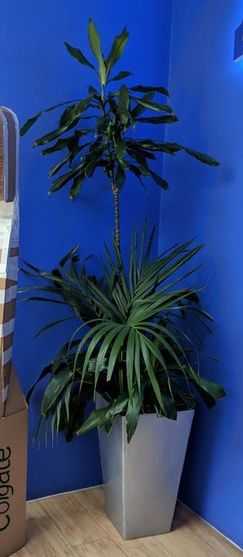
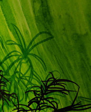
17/10/18 For the rest of the day we worked independently of our groups, producing experimentation inspired by any parts of our photos or new random word - I got 'supported'.
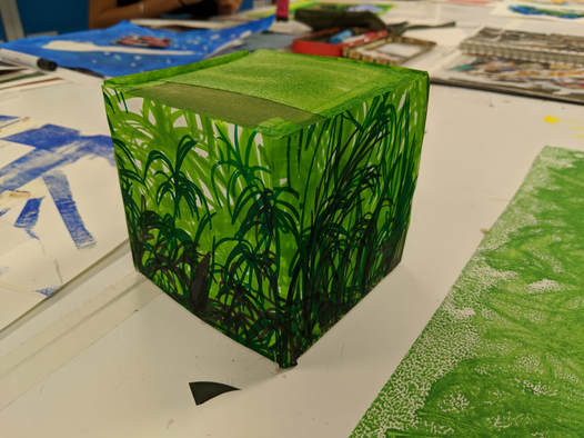
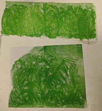
I chose the plant element from my photo on the right and came up with this style of drawing that I cut and glued to a card cube I made. The contrast between natural imagery and man-made shape like a cube interested me.
I chose the plant element from my photo on the right and came up with this style of drawing that I cut and glued to a card cube I made. The contrast between natural imagery and man-made shape like a cube interested me.
|
Right, experimenting with mono-printing:
|
|
On the advise of a tutor I went on to explore the idea of something occupying the space inside of the cube or circle.
This is a rough prototype style model of a sculptural final piece; I like the ink and pen combination here and the wire sculpture in the centre.
If I was to build this properly I would want more layers of green on a substantial circular frame with realistic and stylised plants interwoven together.
The centre would be a grass like green material and the sculpture in the middle would not have a visible base.
The size could be the same, or bigger with more detail. I can even picture it life sized in a circular or square room with the wire tree in the centre.
group evaluation and reflection so far...
- Art methodology - process led making
- Every now and then stopping, reflecting, thinking about how to move forward (after coming up with the pattern I liked, after making the cube and while making my nature ring I decided on making the tree)
- Being open to mistakes - letting chance 'in'
- Allowing freedom - not worrying too much (I like to plan so this was hard for me)
- Open to new directions and advice (I was encouraged by the tutor here)
- Thinking about aesthetic visuals, doesn't have to be conceptual (Mine doesn't have meaning and I chose the plat pattern based on its aesthetic)
- Some people enjoyed thinking through a theme (other than maintaining the same pattern type theme I had no idea what I would produce at the end)
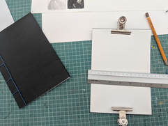
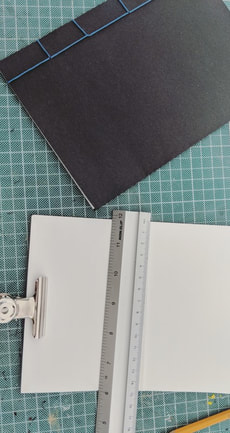
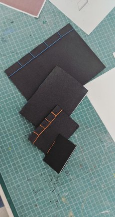
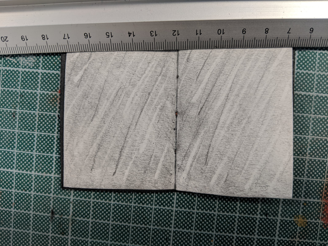
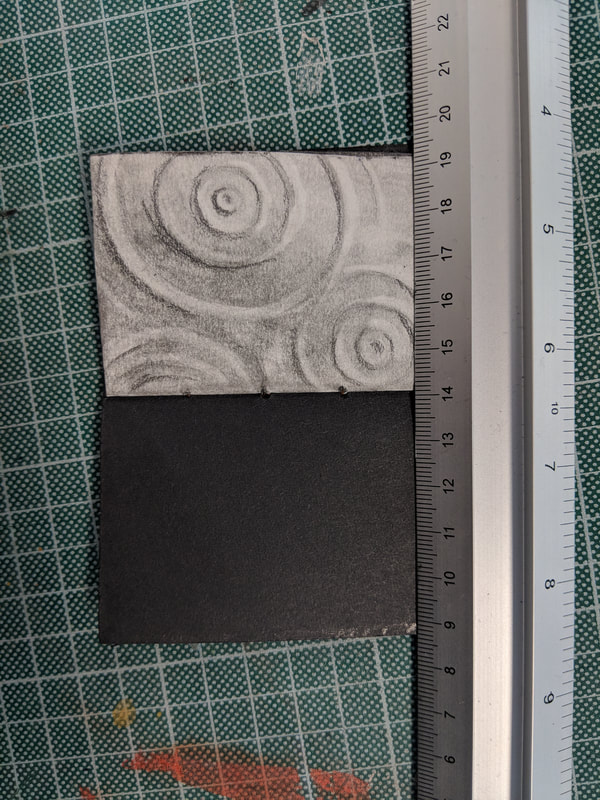
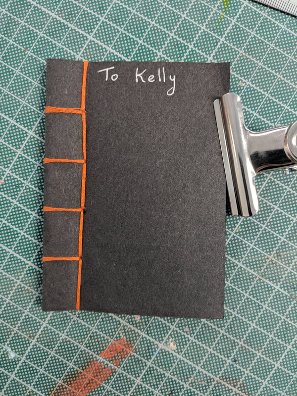
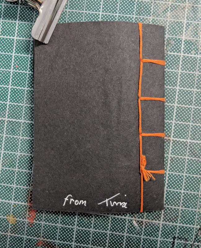
Book Binding19/10/18 We were shown different methods of traditional book binding to try for ourselves. I really took to this so made a few of varying styles:
|
|
|
|
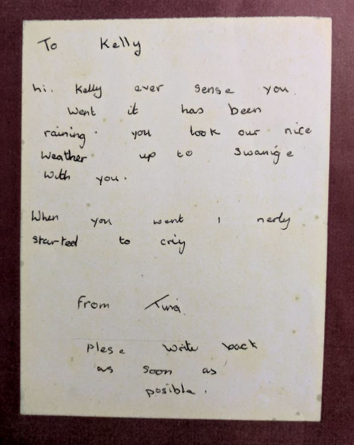
A task was set to create a piece of work using a random bit of writing picked by chance. I got this letter...
|
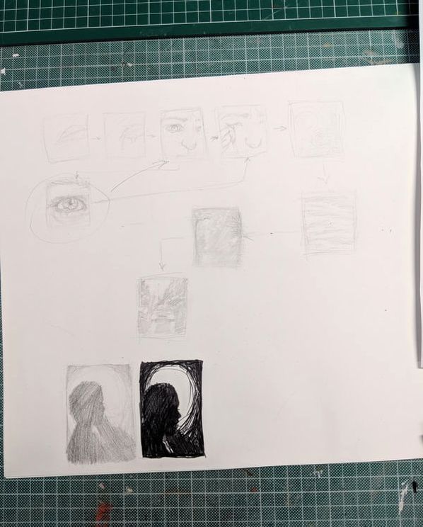
... from here I brainstormed ideas in the form of thumbnails that came to mind...
|
For my response
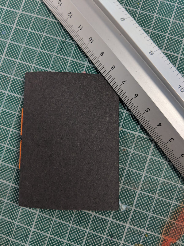
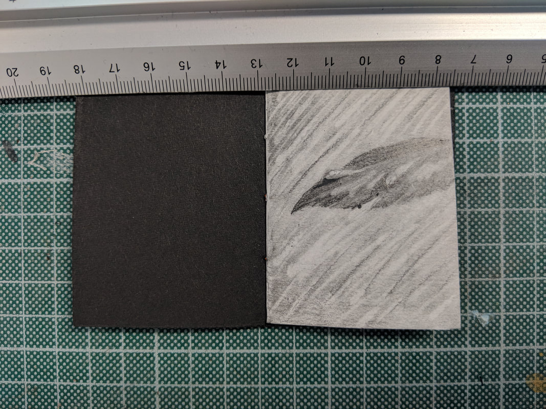
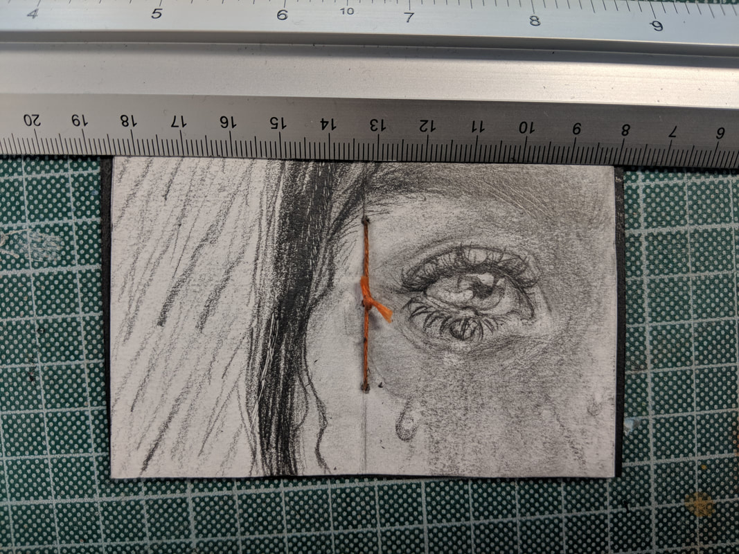
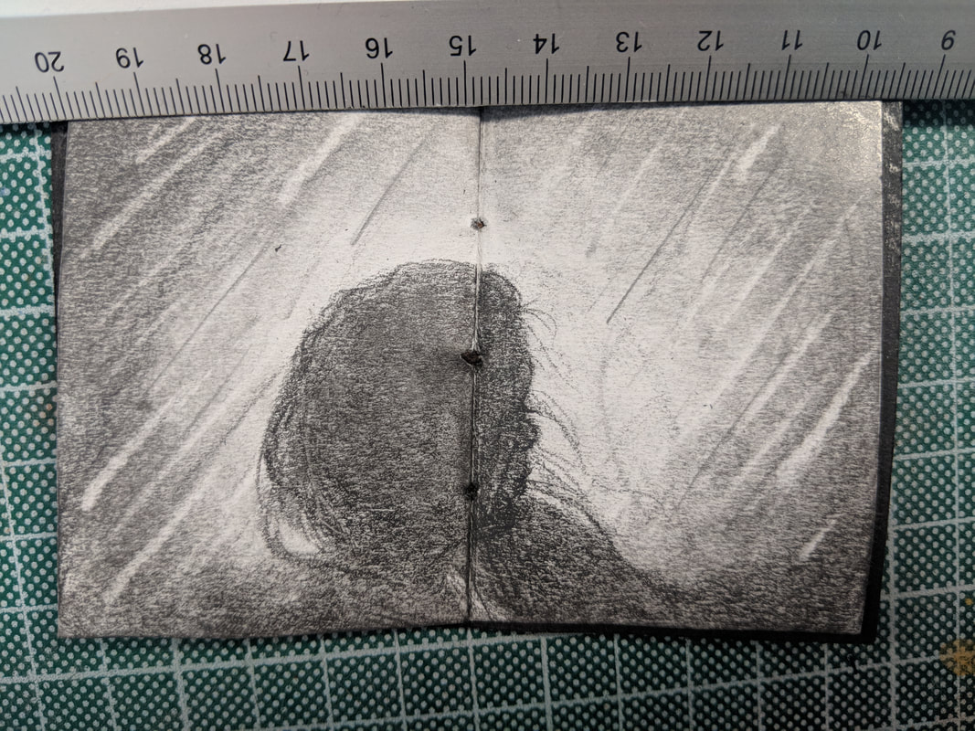
Book 1 - the smallest one I made (the ruler gives you a sense of size).
Illustrated in pencil a few pages on the theme of water and tears.
I feel like my drawings were a bit rushed so it looks more like a plan for a larger scale book but this gives it a certain charm.
Illustrated in pencil a few pages on the theme of water and tears.
I feel like my drawings were a bit rushed so it looks more like a plan for a larger scale book but this gives it a certain charm.
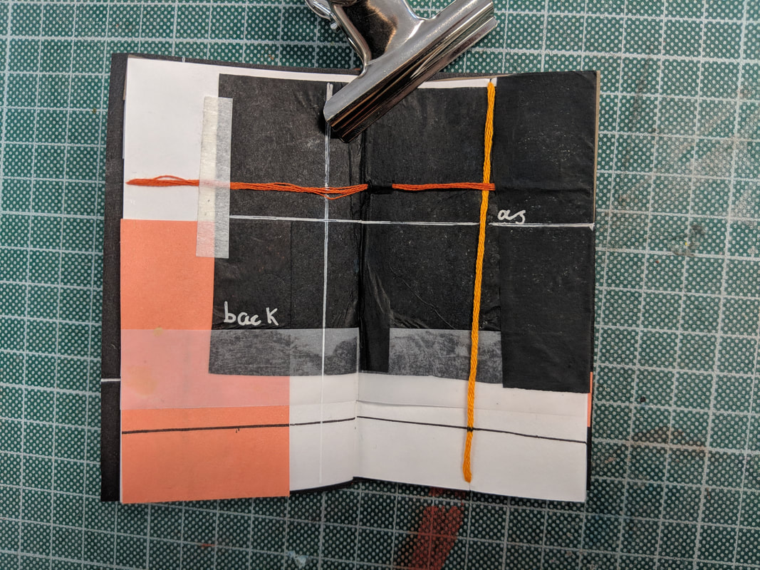
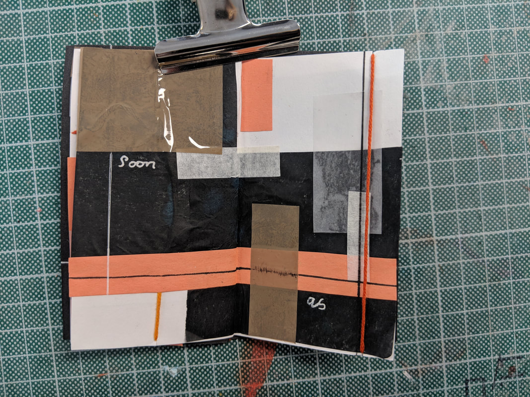
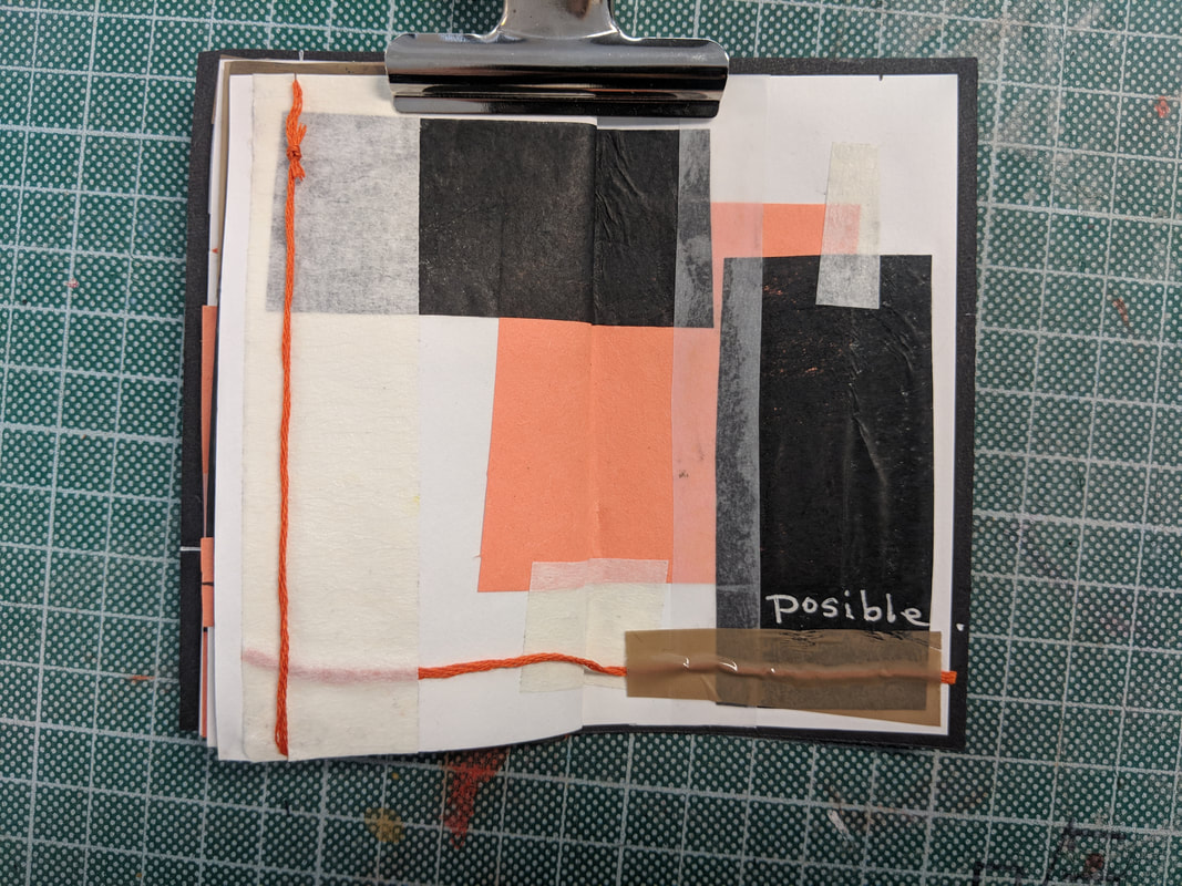
Book 2 - double the size of the first.
Abstract art collage with the last few lines integrated in to the work in the hand writing of the girl's.
I liked making this one and just seeing what I could do in the moment, it was made completely by chance. Created using paper, tissue paper, pens, string, masking tape and parcel tape. If I were to do this again I would use a cool colour palate focusing on blue because of the references to water.

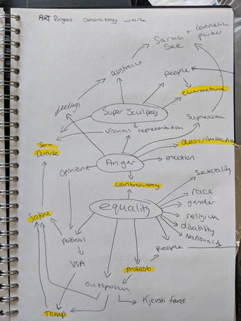
Idea generating and Research
Starting our new project we were to come up with and research an inspirational word, phrase or theme of some kind. To find an idea by chance I used a dice, 6 choices for three different titles:
Form;
Form;
- Sculpture (paper and card etc)
- Painting (watercolour)
- Pencil drawings
- Ink drawing
- Acrylic painting
- Sculpting with super sculpey
- Anger
- Fear/worry
- Happiness/ joy
- Sadness/ grief
- Surprise/shock
- Shy/introverted
- Death
- Identity
- Equality
- Environment
- Conflict
- Freedom
Looking at various artists and sources
|
20-21/10/18
|
|
|
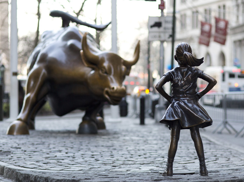
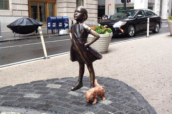
- The girl came to represent the presence of women everywhere, a symbol of strength and determination to stand up for our gender in reach of equality. The dog statue was added by an artist fighting for the rights of the original maker of the wall street bull, believing it changed the meaning of the bulls purpose and violated the artists rights.
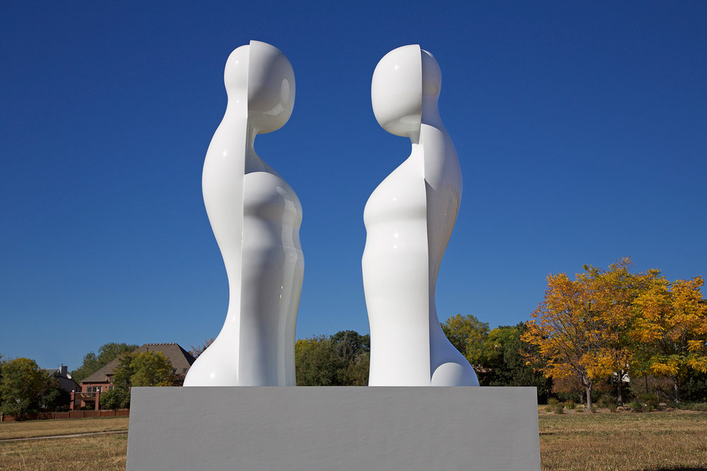
Roger Reutimann - 'Common Unity' a stunning statue of two identical figures facing each other. I particularly like this as the people are completely anonymous and form a type of blank slate that people can project their own interpretation onto: gender, sexuality, race, religion e.t.c. are all unknown and irrelevant as they are two equals no matter what.
|
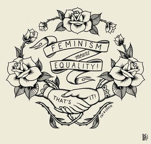
Kjersti Faret - ' Feminism Means Equality!'
Personally I really like this illustrative work as there is a stigma around the word 'feminist' and what it means to different people. Farat literally describes her work with only the definition: "Feminism (noun): the advocacy of women's rights on the grounds of political, social, and economic equality to men." |
|
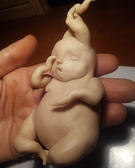
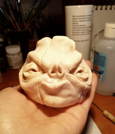
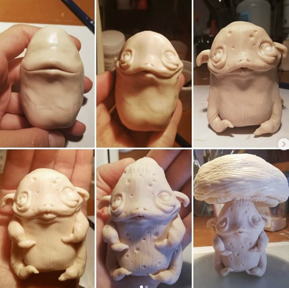
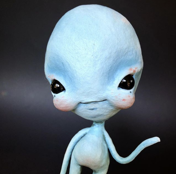
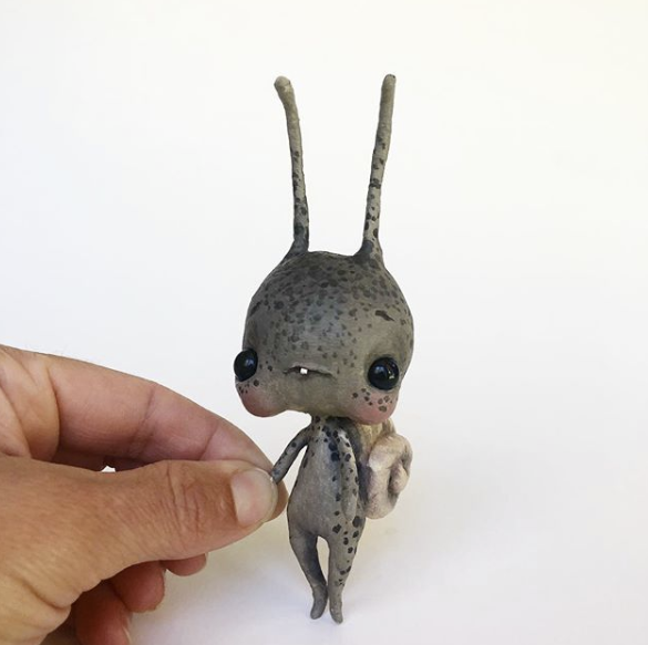
Jake Corrick - a link to his instagram where he posts his work as a sculptor who uses super sculpey and other modelling mediums, it is incredibly detailed and a great inspiration. Here are a few examples of what he makes:

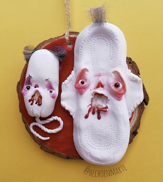
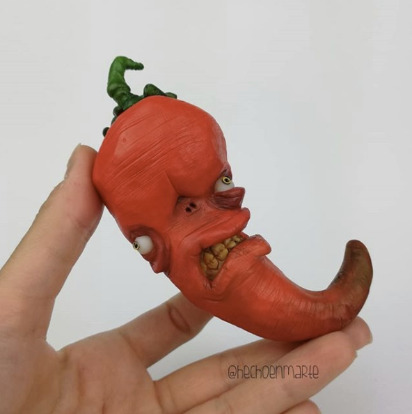
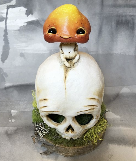
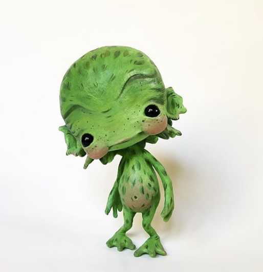
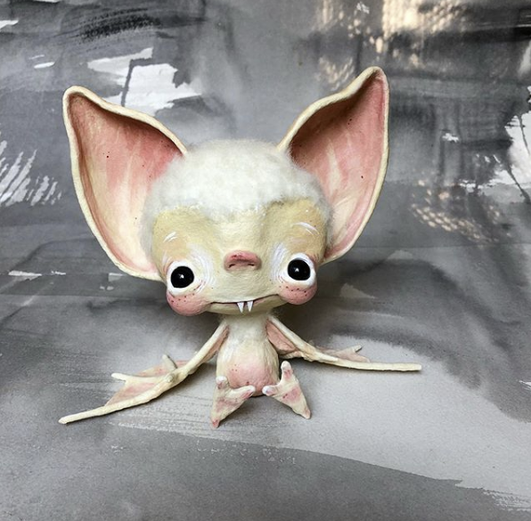
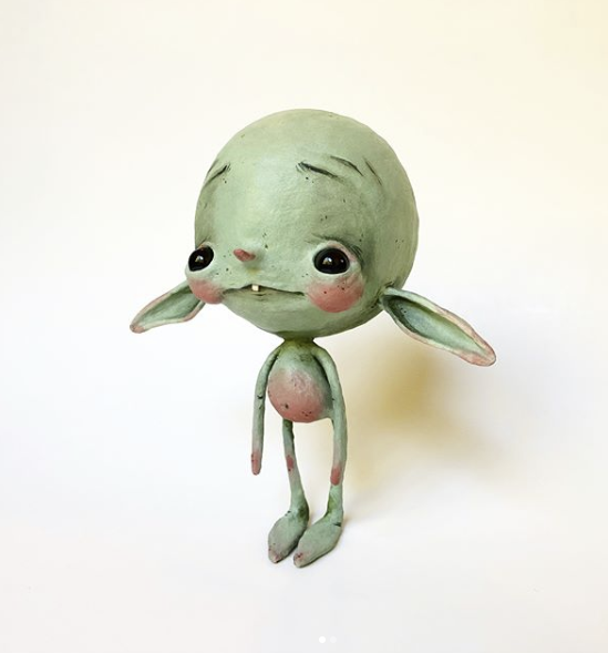
Hecho en Marte is another example of a sculptor who produces small scale creature designs but she has a more playful cartoon approach which occasionally has feminist themes:
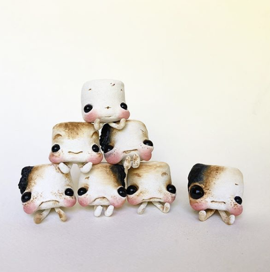
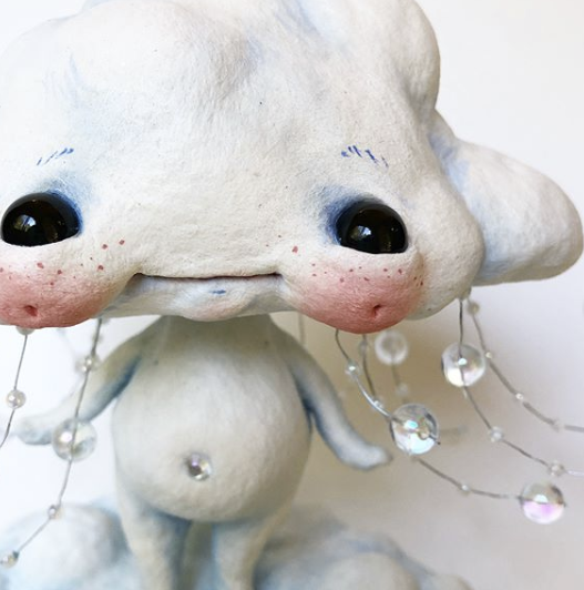
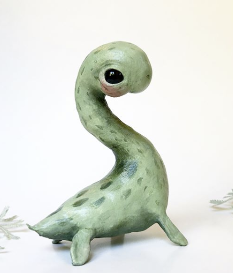
Sara Duarte also makes small sculptures in a disproportioned 'cute' style. I admire her skill in creating such strange and wonderful creatures.
|
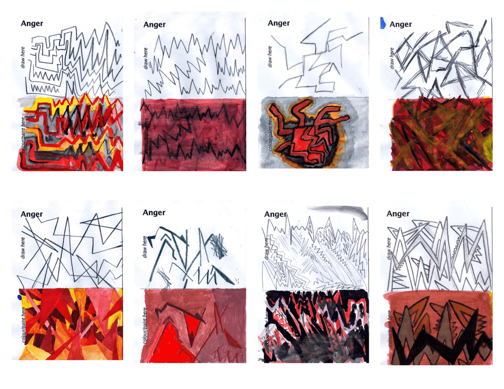
While searching the internet for various sources I discovered this page which contains various teaching materials and I found this image particularly good at representing what anger looks like to people. (Right)
I thought this was a creative way of illustrating an emotion that people all feel. Red is the colour of passion, anger and strength. This video describes the use of colour in films as a way of influencing the viewers feelings: |
|
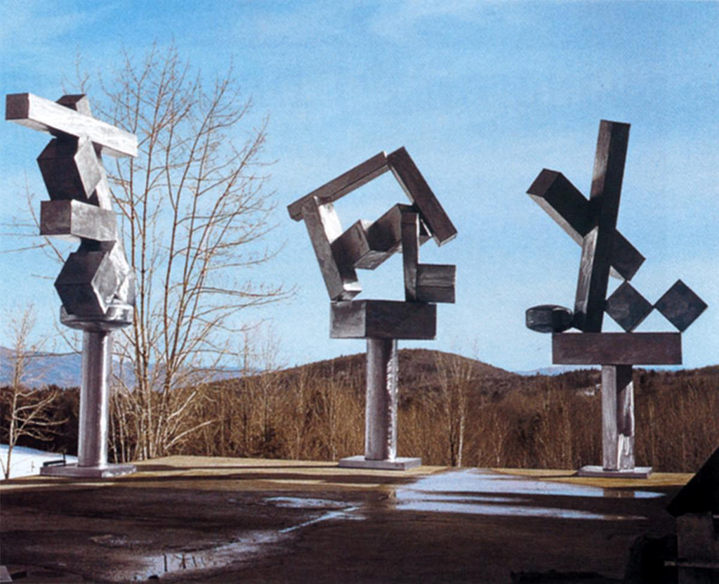
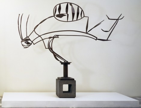
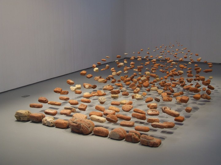
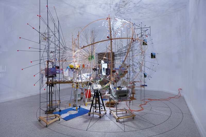
Here is a collection of artists who work in the three dimensions:
- Diana Cooper - The colours and shapes of her work reflect that of the 'attitude' of my project. I like the mark making and use of patterns
- David Smith - very simple sculptures
- Cornelia Parker - The use of light and shadow here inspires as I instantly think of how a small thing can cause a huge shadow much like cause and effect in emotions

- Antony Gormley - Another simplistic artist
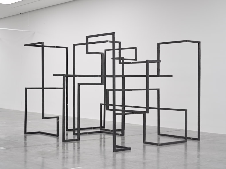
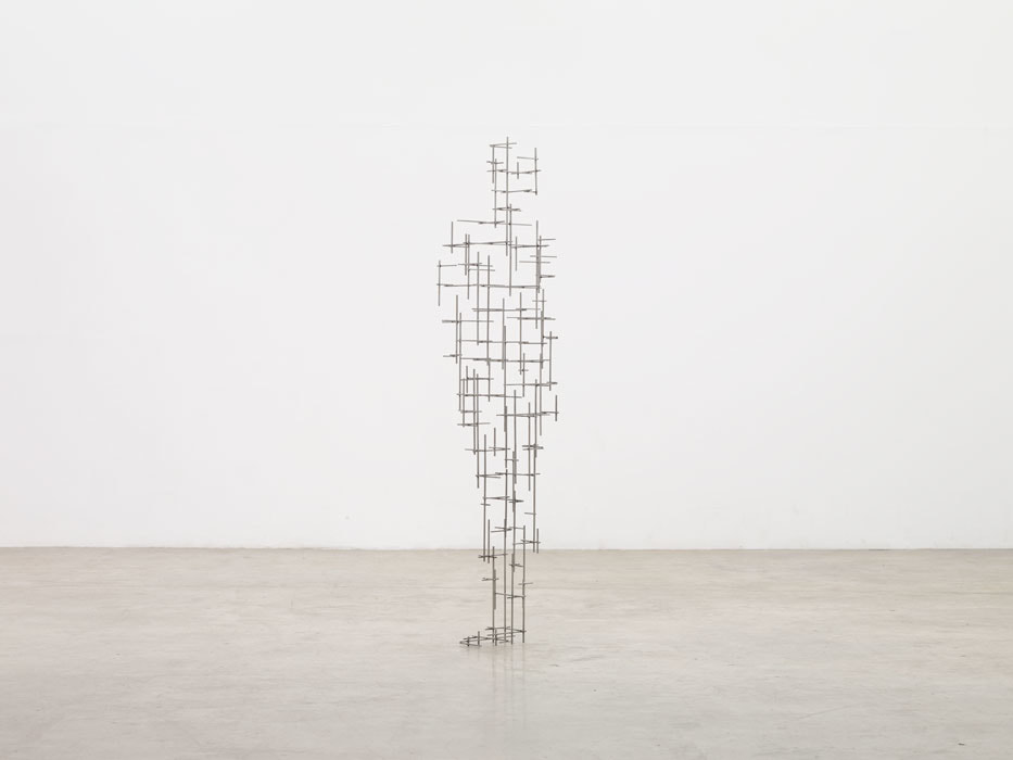
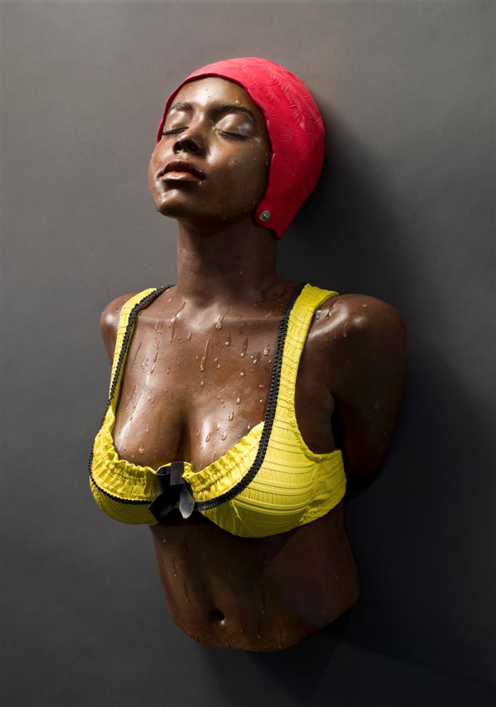
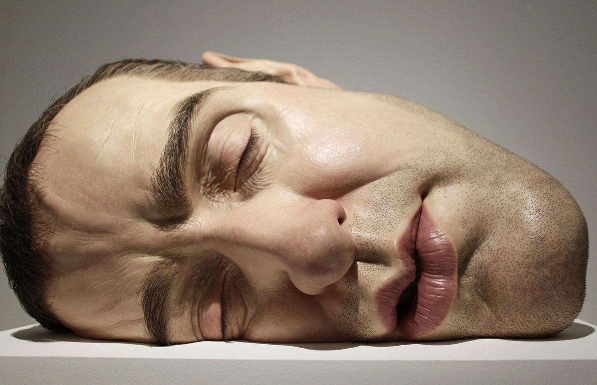
- Carole Feuerman - her incredibly realistic sculptures could be used to literally depict emotions

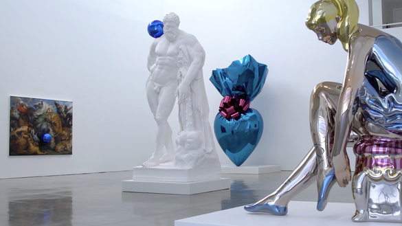
- Jeff Koons - These fun sculptures are another interesting way to depict anger; as a bubbling, living form

- Sarah Sze - a three dimensional collage, the second looks like a type of explosion of materials which could represent that of anger radiating from the centre
- Ron Mueck - huge grotesque life like sculptures

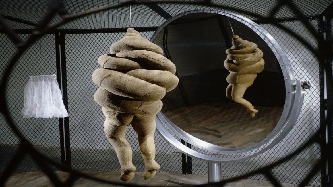
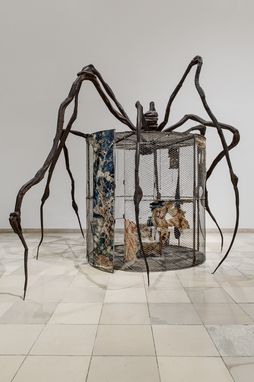
- Louise Bourgeois - distorted/abstract sculptures
Some of the articles I have looked at:
- https://edition.cnn.com/2018/05/31/us/equal-rights-amendment-illinois-states-trnd/index.html
- https://www.thegospelcoalition.org/article/9-things-you-should-know-about-the-equal-rights-amendment-era/
- http://www.equalrightsamendment.org/
- https://www.independent.co.uk/news/world/americas/us-politics/donald-trump-transgender-rights-lgbtq-gender-identity-bathrooms-military-education-a8595131.html
- https://www.bbc.co.uk/news/newsbeat-45838021
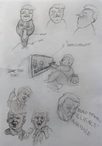
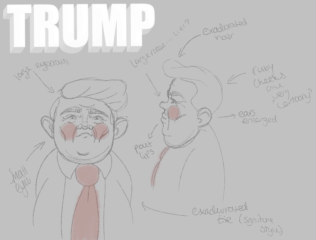
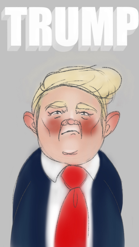
Practical day22/10/18 To begin my creative process I brainstormed in my sketchbook to generate ideas and connections.
These are some sketches based on an idea that came of my highlighted terms. (right) I digitalised my Trump design: |
|
|
|
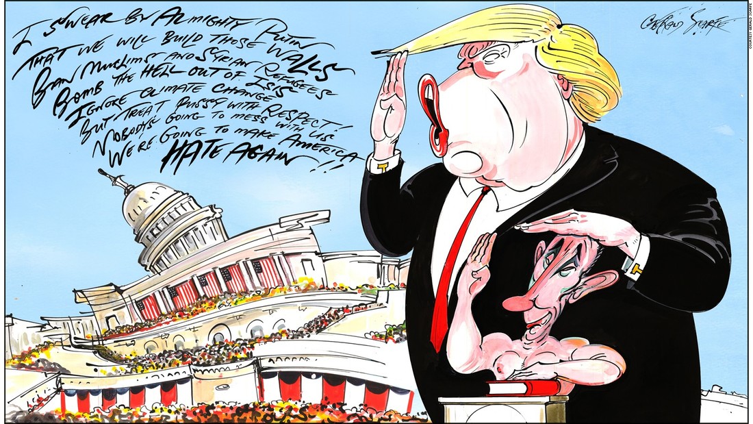
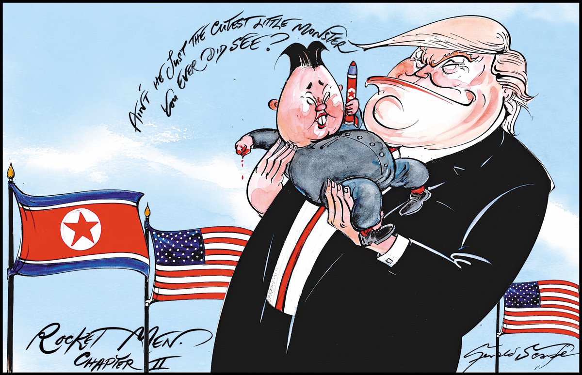
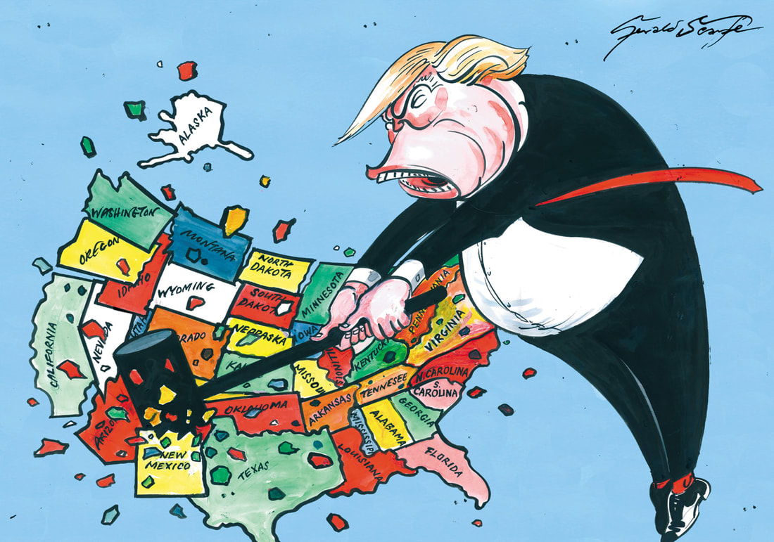
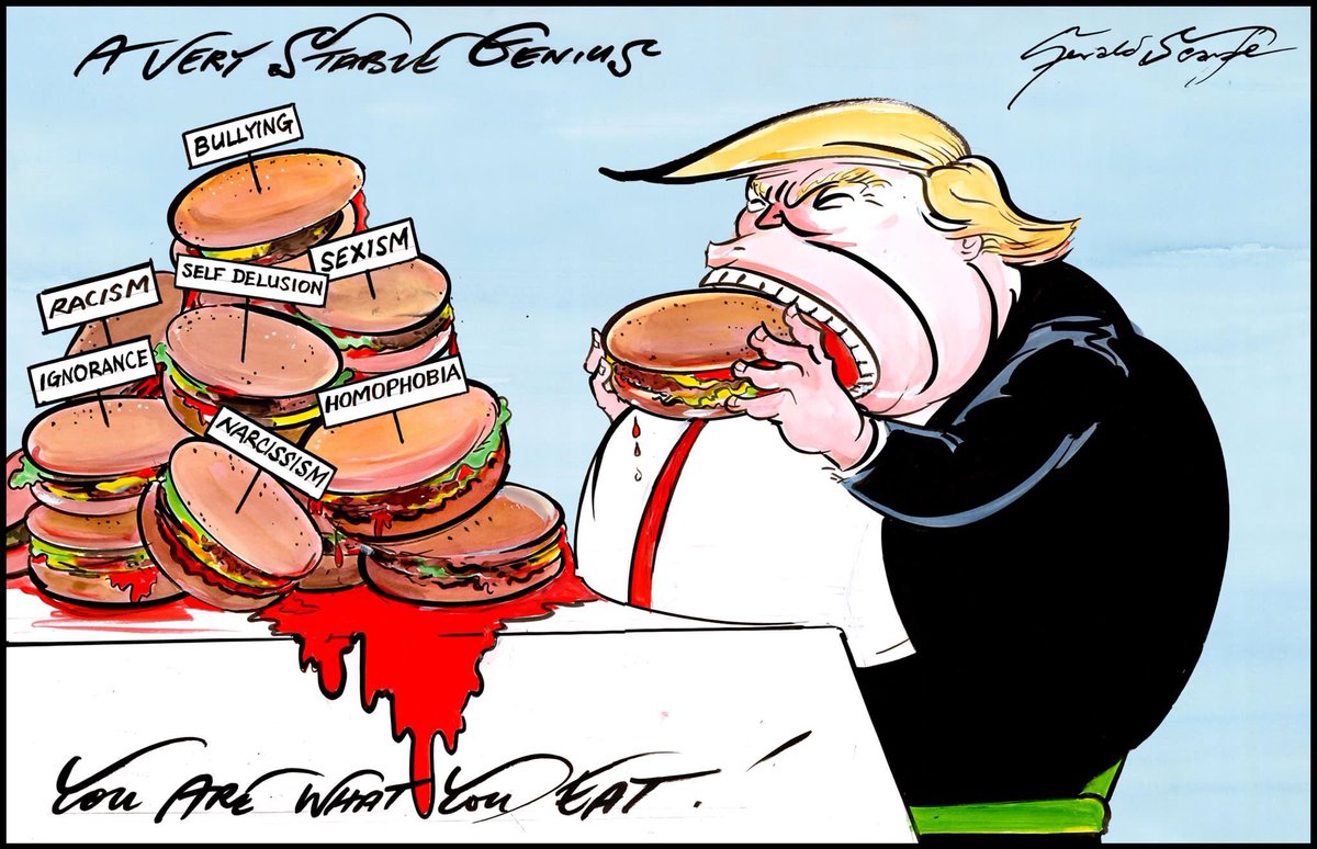
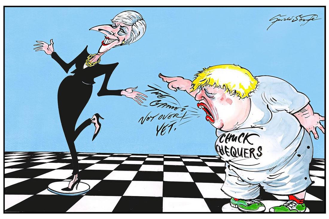
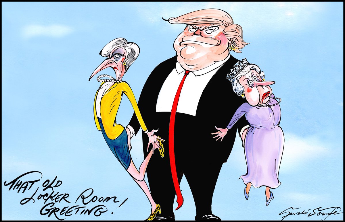
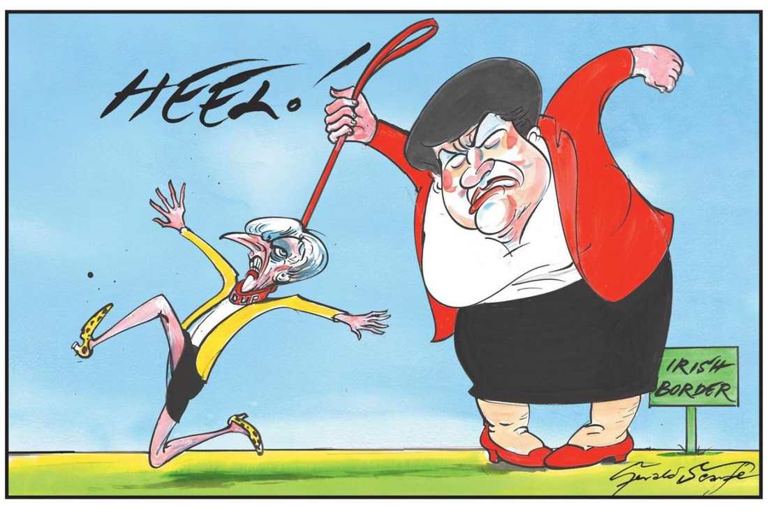
On advice of a tutor I looked at some satirical cartoon art (below)
|
gerald scarfe |
|
|
|


|
|
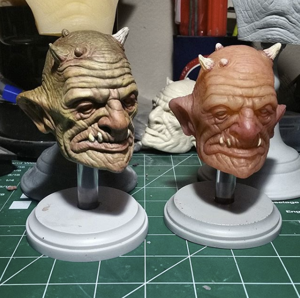
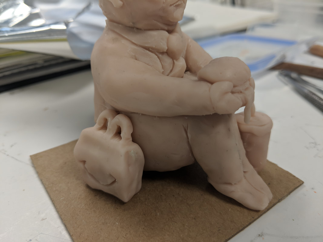
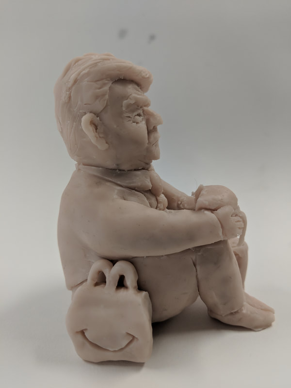
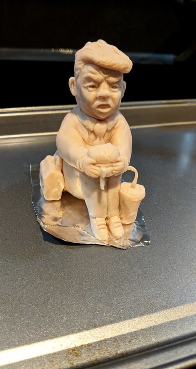
Super Sculpy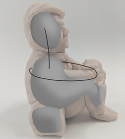
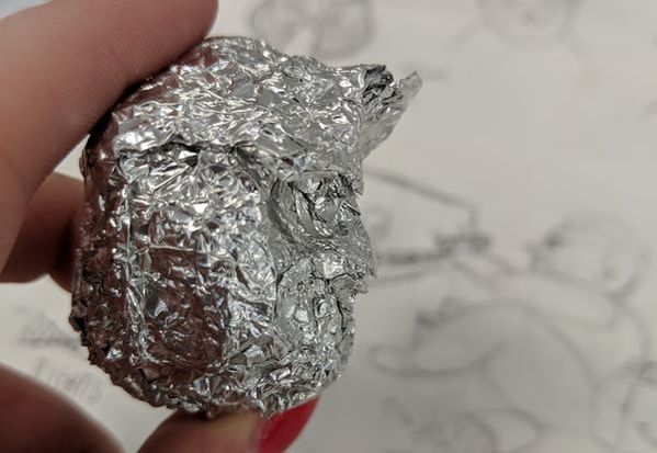
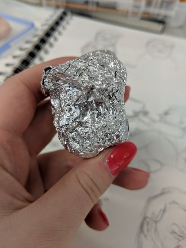
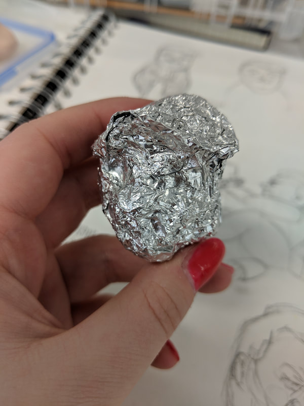
Where the tinfoil and wire is in the sculpture
|
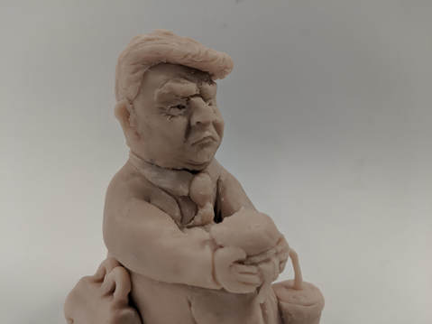
This took me a very long time to make.
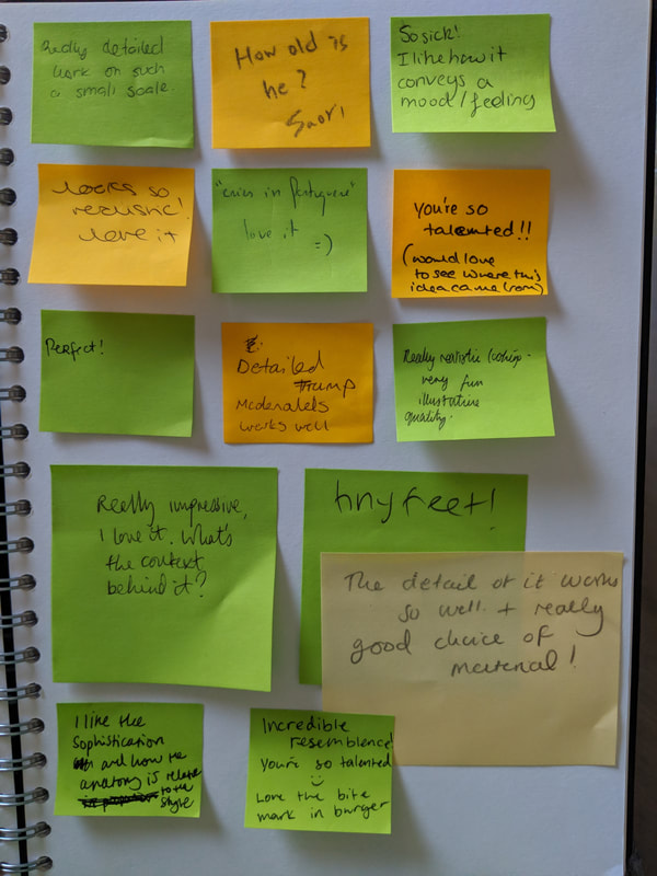
I got good responses from the group when we did sticky note evaluations on each other's work (right). |
|

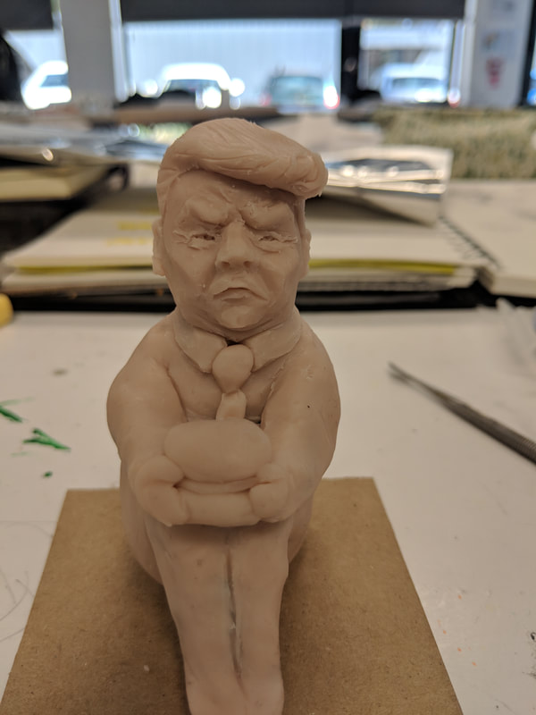

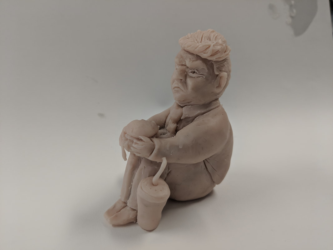
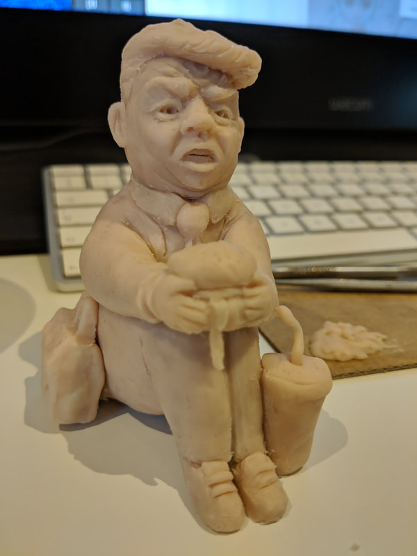
I felt he didn't look angry enough so I changed his mouth to expose teeth and made his forehead creases more defined to emphasise the eyebrows. The second image is the model about to go in to the oven for around 45 minutes (consisting of 20mins and then 5 lots of 5mins- I took it out and checked on it periodically to get the time right).
|
|
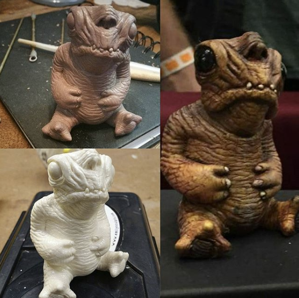
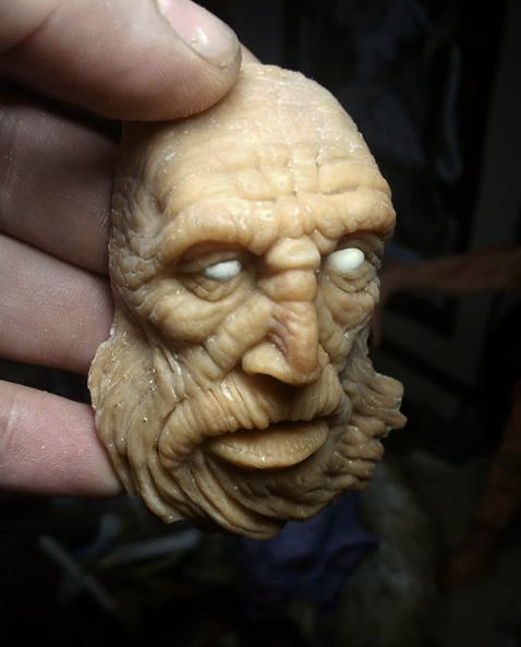
Two heads - Realistic and cartoon
|
24/10/18 I really enjoyed making the the realistic head - getting the detail right with the mouth and nose are my favourite areas to sculpt:
|
Despite enjoying realism I wanted to make a more simple, cartoon-like head. This involved not going as much detail in the hair and skin texture:
|
(Annotations on each photo bellow)
|
I made a rougher head from just tinfoil on the recommendation of a tutor. Inside my sculpey models are tinfoil balls to limit the thickness of the clay and so making a mould of just the foil connects my set of works (right).
|
|
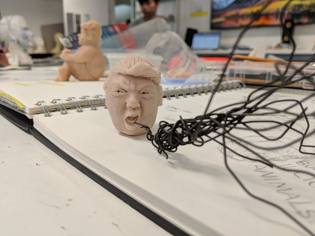
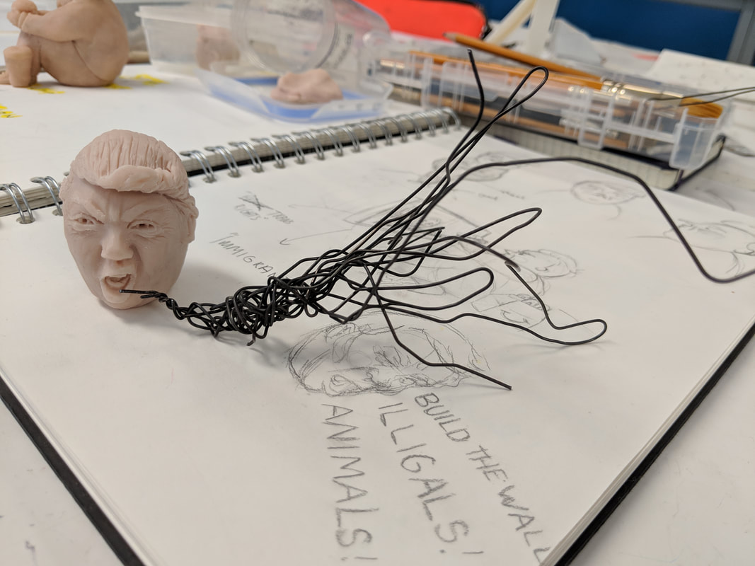
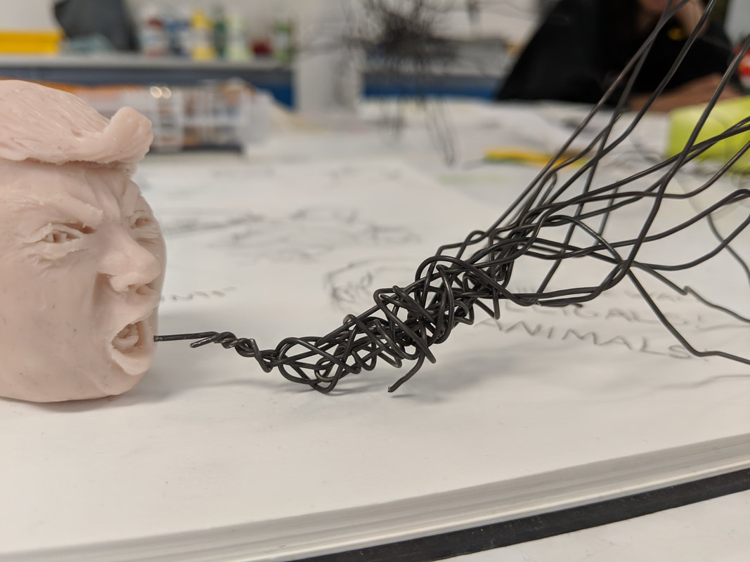
Composition ideas |
I really like having the wire coming out of his mouth kind of like a speech bubble. I particularly like the first of the three images where he is facing the camera and the wire extends to the viewer.
If I was to improve this I could have interwoven words in to the wire forming his own quotes that are not supportive of humans being treated equally. However, with this wire it was very hard to work and with the time I have left on this project there is no time to get anything more maluable. |
|
|
|
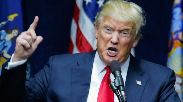
Standing figure25/10/18 I wanted to make a standing figure like in my design sketches at the start of my process. I chose a classic pose Trump does when becoming emotional giving speeches.
|
|
Stage one: Art Brief
|
|
In a group of three we evaluated and reflected on each others projects in an assessment style format. I got a generally positive response to my blog and my work on this project.
I fell down on my ideas exploration because of the lack of consideration for an audience at the end, the lack of colour and the lack of health and safety (using the oven, cutting the wire etc). |
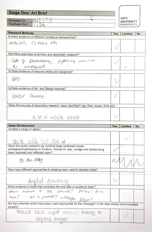
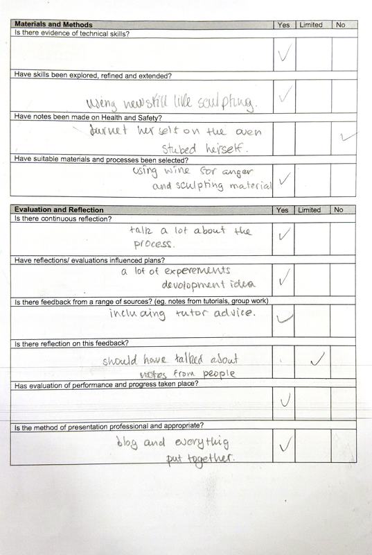
To improve my outcome I would include colour - red (for both anger/passion and the republican party) - I would want to experiment with how I do this, it might be the figure is completely red, or just elements such as the tie, his cheeks and a banner for example. Ideally the wire could form words or quotes that some people dislike and others like; provoking various emotional responses from the audience which mostly will orient around anger; the trump character is angry, some people dislike Trump they will feel anger at him/his party/his supporters, sympathisers and supporters of Trump will feel anger at the same things Trump is angry about or at me for the art, depending on their interpretation.
